Overview
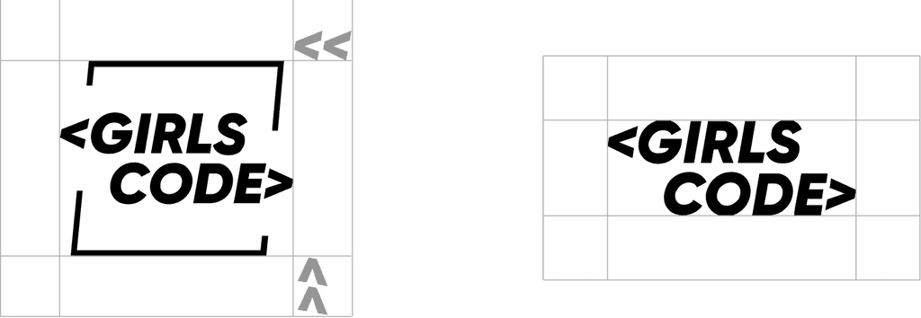
Girls Code is an organization that helps women get a grasp of the technological industry by incentivising participation in friendly communities with workshops, bootcamps and courses. They needed a strong rebranding to invigorate the mood with a friendly yet professional appearance.
Overview
For Branding my process consists in diving into meaningful conversations with the stakeholder. The more I dive deep into their personal meanings the more I can grasp things visually to communicate their values to the public.
Concept: To break a mold
Girls Code pretends to help girls “break the mold”, this concept was used on the new brand as it represents the attitude they want to carry to girls in tech.
Choice of color:
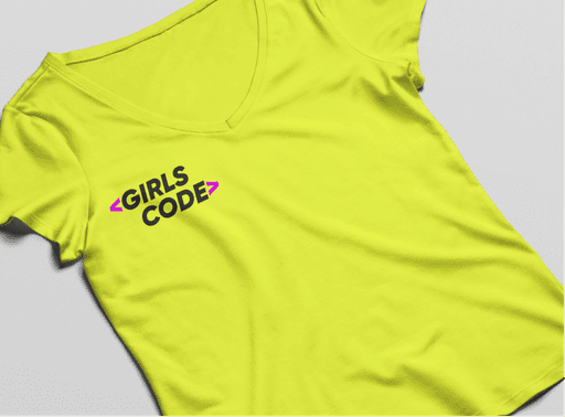
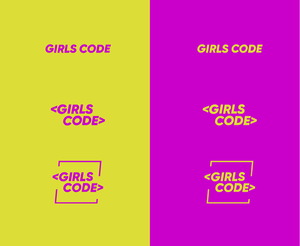
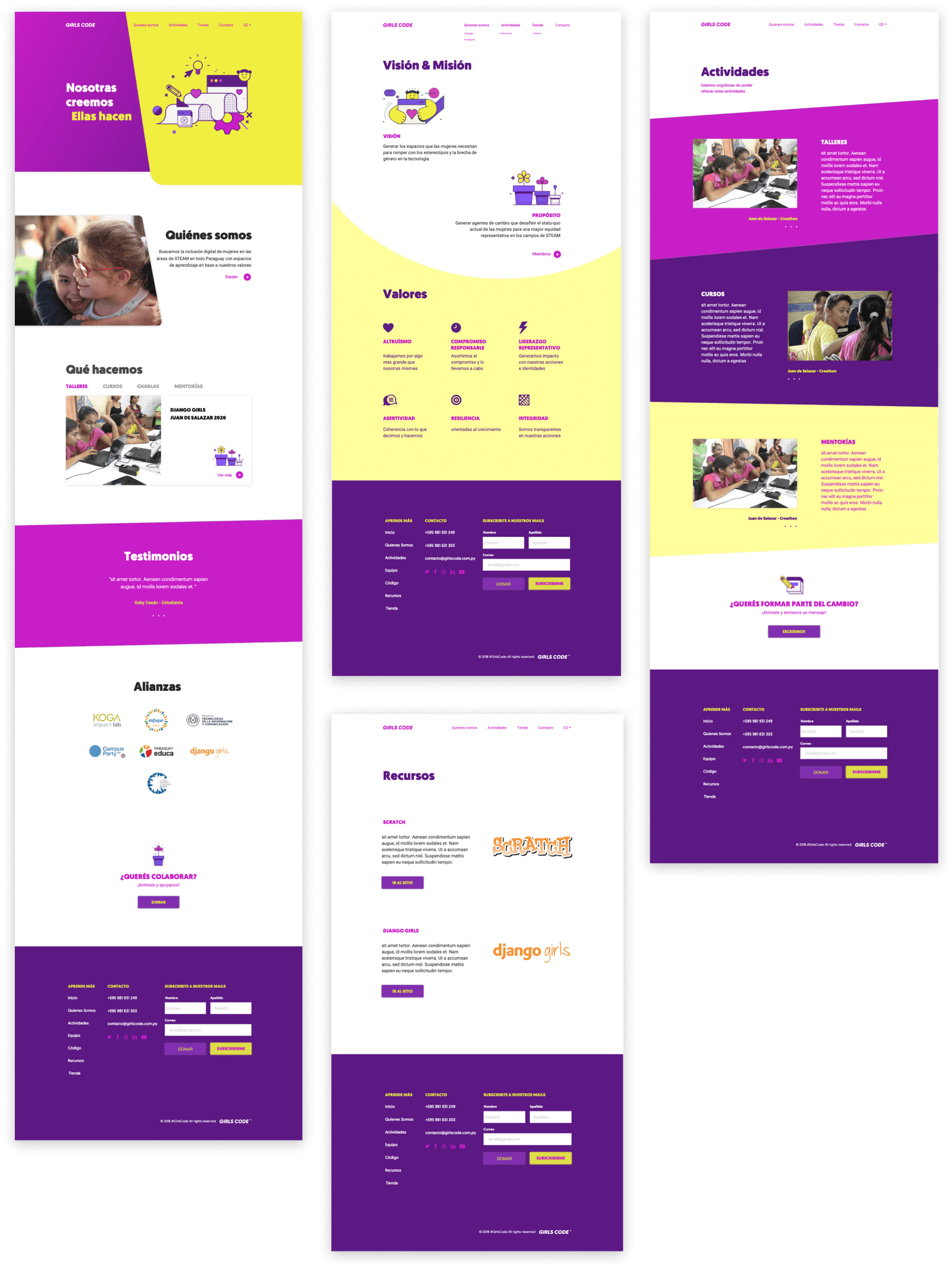
Girls code gets a combination of different strong and electric colors to show off the desired change in attitude. Aggresive, dynamic & equally bold.
Choice of Type
A sans-serif font was chosen and a tilted variable was secured to establish the concept of “tilting the balance” with a slant.
Conclusion: Tech power is Girl power
Girls Code is a brand that needs to be powerful yet friendly for the sake of the people it represents. With a friendly electric display of colors and a flexible dynamic it can translate everything it intends to communicate. It was important to me to get to understand how to translate such values into a brand and I'm happy it worked out really well.


