Overview
Explain Data helps you to inspect, uncover, and dig deeper into the marks in a dashboard as you explore your data. There are many use cases for Explain Data and each gives a different analysis when you run the feature over. The challenge was to develop the feature further for ”Missing Values” in your data
Outcome
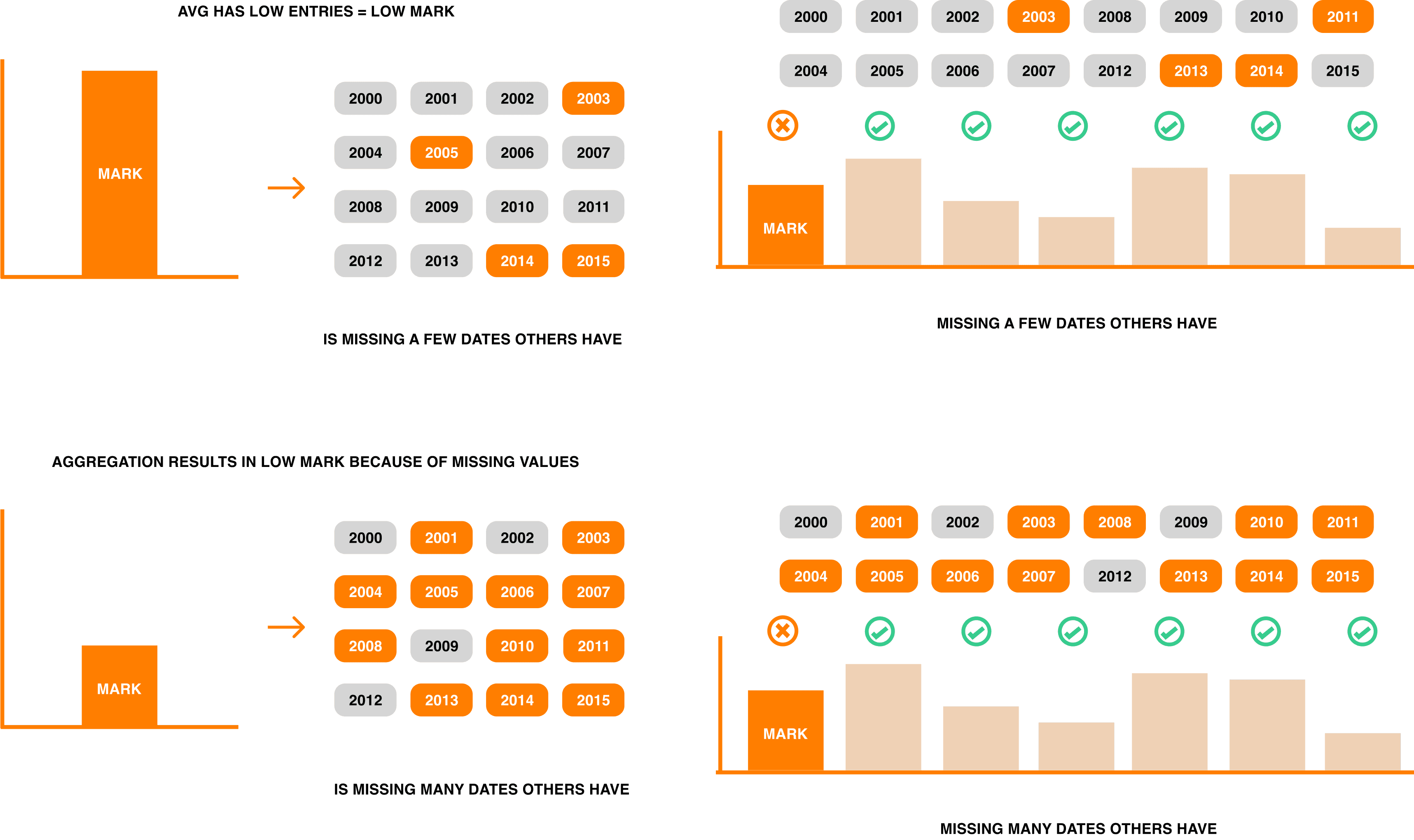
Illusions in skewed data can happen. And this is a risk for decision making.
In order to avoid uninformed conclusions we propose adding an explanation centered around Missing Values by helping users contextualize their data.
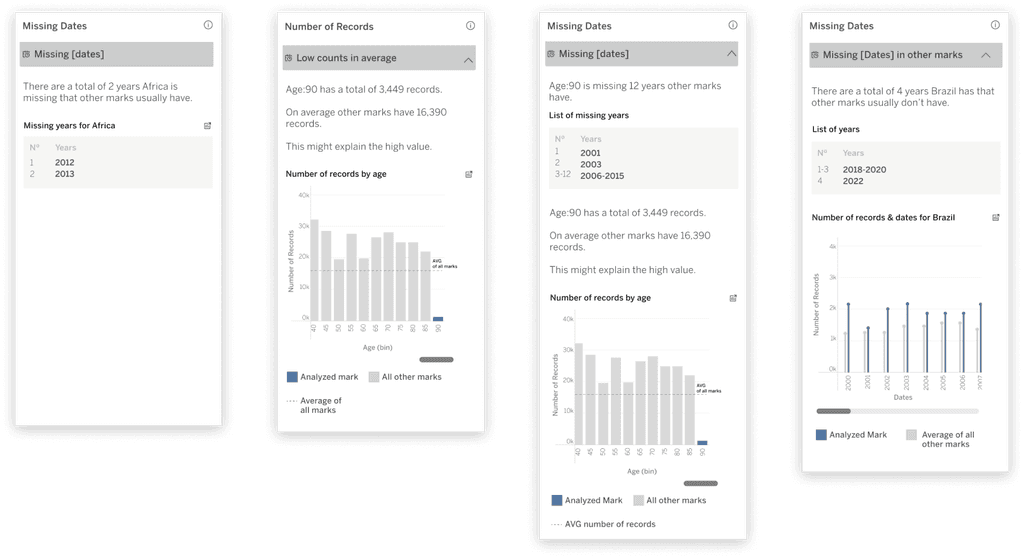
Simple Case
Complex Case
Number of Records

The process
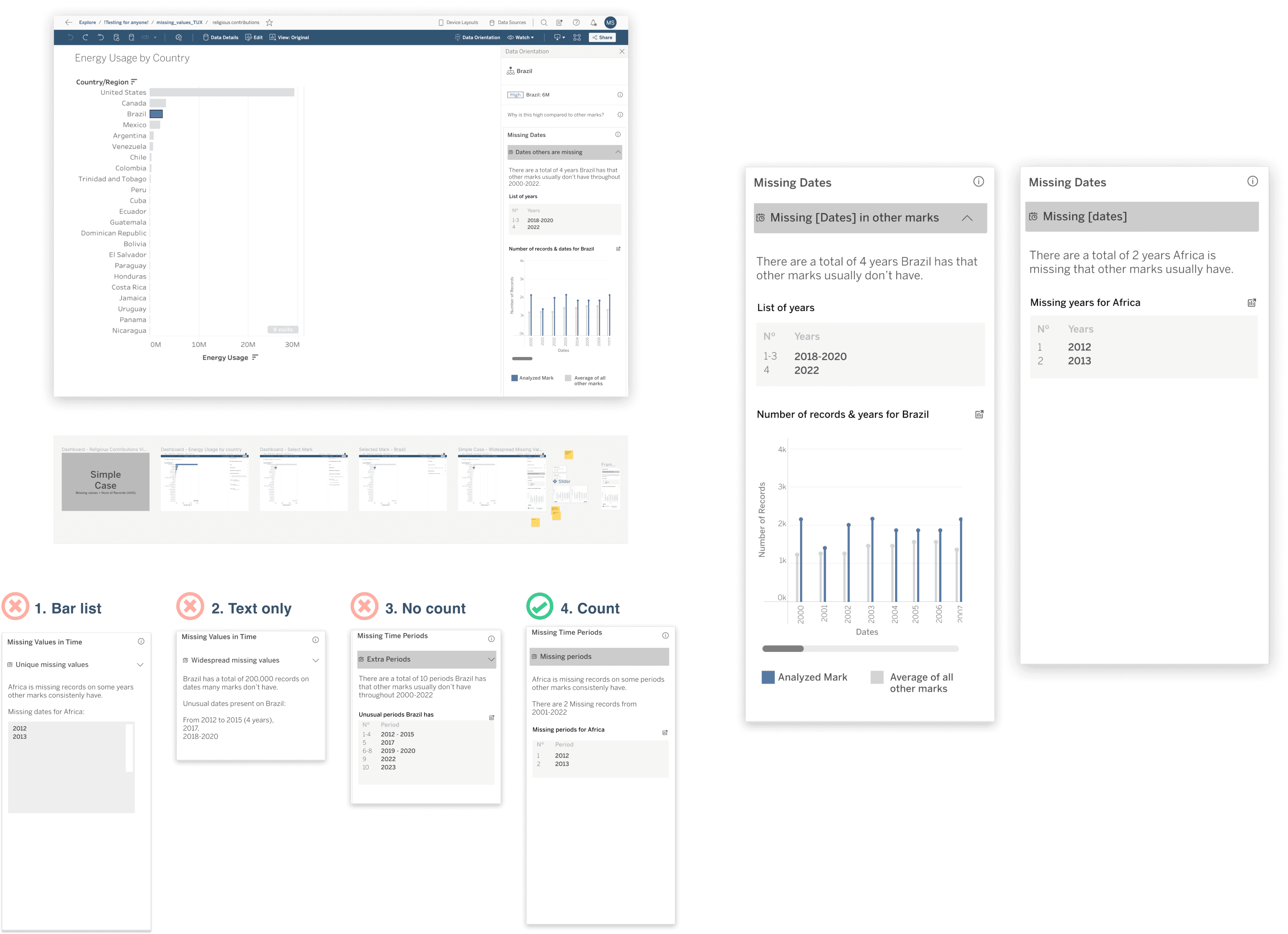
This design sprint consisted in first understanding how engineers are going to develop the tool and the range of execution it can hold. Through talking with all the parties involved we were able to determine 3 cases for the Missing Value concept. Through internal user testing with users in business role we were able to gather insights for both the general feature and the specifics of the explanations.
Getting to know the tool and the parties involved
The first step was to understand the engineering side of things and understand the context of the people who use the tool.
Initial Prototyping & Iterations
I started prototyping since the beginning, quickly trying different types of data representations. In most, bars were a no go but I managed to find charts that would get the job done.User Testing and refinement
It was difficult to find business people that work with data, so we decided to internally call Tableau's own employees who were familiar with the featureDocumentation
After agreeing on the iterations with the information gathered from testing we decided to set everything up on a hi-fi design file and document it.
Simple Case
Complex Case
Num of Records

Conclusion
Users qualify explanations in Explain Data as useful. However Explain Data currently does not follow a clear mental model for insight discovery. Time has not been identified as a barrier as previously thought but an apprehension to go through a cascade of explanations that intimidates the user has been identified. Analysis by paralysis is a cognitive bias.
Taking a step back. Explain Data was designed to fit Tableau but the feature finds it difficult to cater to the Business user. Discoverability is a core issue as well as usability for workflow integration.

Non obvious point of data that are not exaggerated often get ignored. People trust outliers.

Calculations are hard to get. And people need support when it comes to understanding them

Findability is an issue that should be taken when looking at the general UI. Users have trouble finding Explain Data


